

This year's 2nd Annual Georgey Awards had many components both print and digital. The overall look was clean with a bit of hollywood sparkle to match the feeling of the night. The goal was to bring a bit of elegance and shine to something that is usually raw, rugid, and dirty– college athletics.
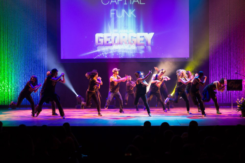
All pieces released prior to the event or printed were in the lighter buff and all dark pieces were shown exclusively during the event. Over 70 screens were created for awards, nomineeds, winners, and various presentations.
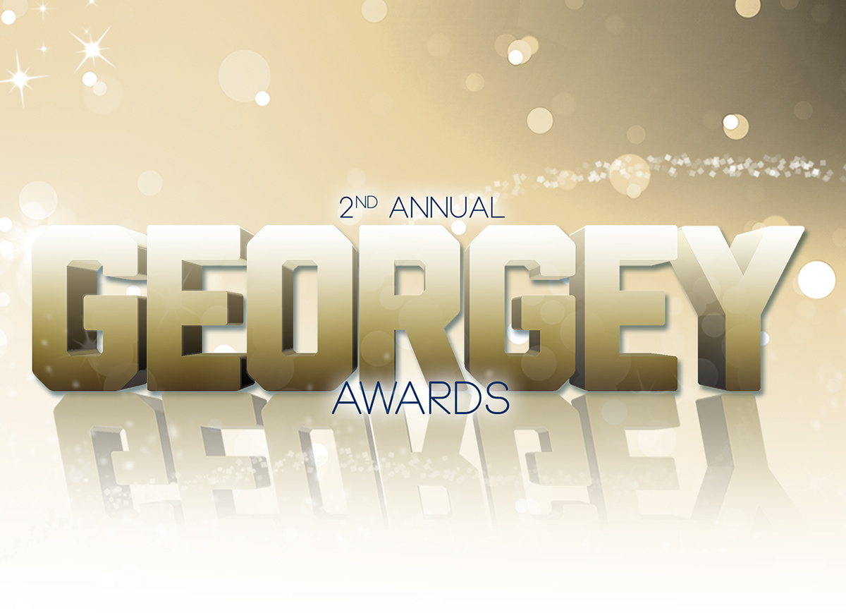
The word Georgey and the blue blackground were not produced by myself but another graphic designer. You can see the original pieces and compare them to the modified versions used my designs.

Welcome screen as the students and staff walked into the auditorium. This similar look was used in the GWsports.com story highlighted picture, rotator advertisement, preshow nominations video, and social media components. (16:9)

Softer and lighter buff screens were used for online, social media, and video components.

Twenty six custom 5" x 7" Winner Cards were individualzed for each award with name of award, name of athlete and/or team.
Front of 5" x 7" winner cards

The program easily allowed the audience to follow along with the event and provided hashtags for social media to be able to track pictures and tweets sent throu

Dark place holder screen used in between each presented award or during transitions to performances or next award presentation. (16:9)

Example of a title screen for individual awards (16:9)

Example of a nominee screen. Design was simple and understated to bring the focus to the student athletes, but staying with the dark and stylistic overall theme. (16:9)

Example of a winner screen. This year, we wanted the winner's picture to be more dominate but the overall look to really pop off the screen and contrast with the nominee's screen.
(16:9)
(16:9)


Background purchased via http://bit.ly/13fBbCd

Original Georgey text created by the George Washington University Creative Services Department in 2012.


